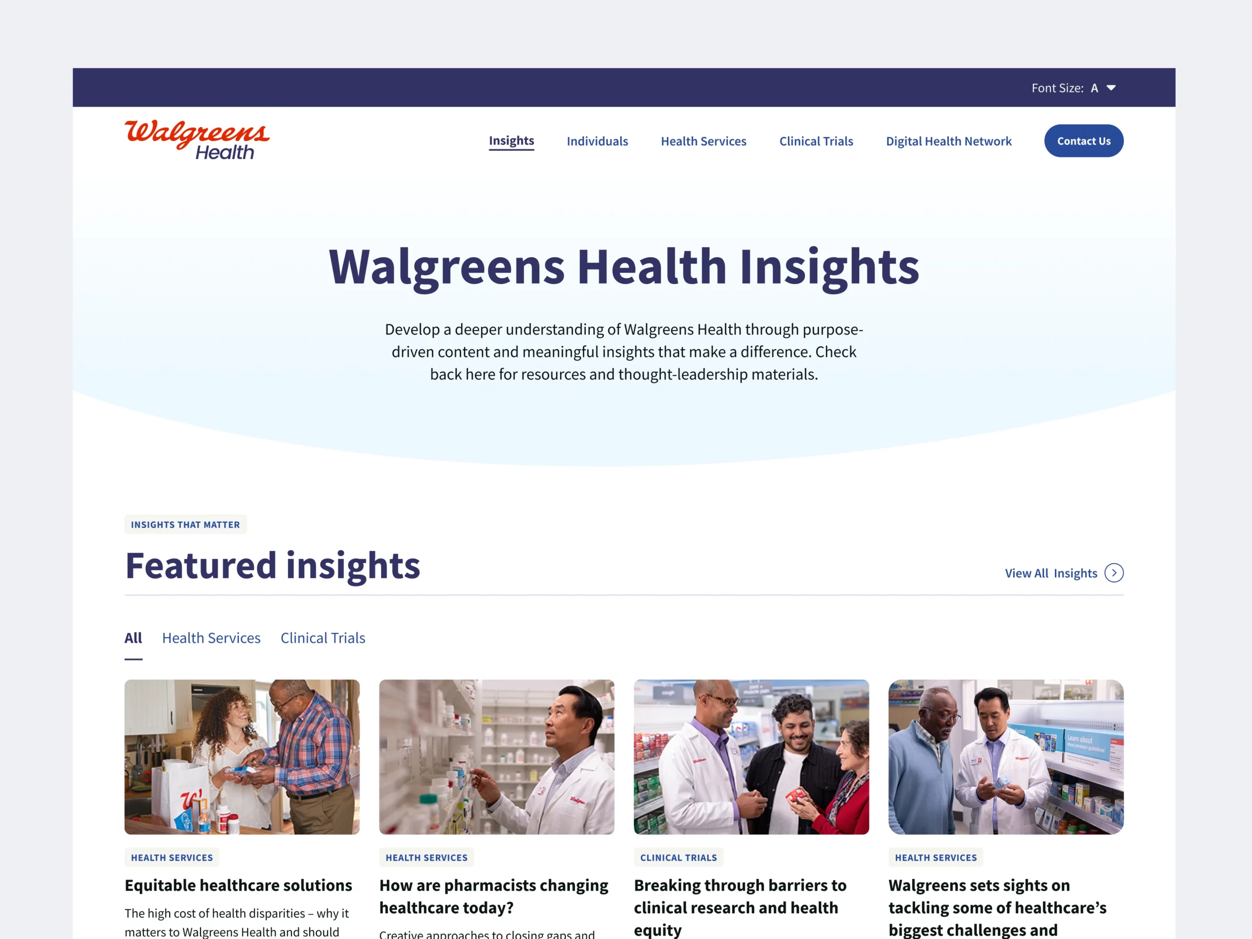
Walgreens Health
Agency
Boldworld
Contribution
Web Design
Tools
Figma
Walgreens Health was established to support the everyday health decisions of patients and providers. To launch this new initiative, they needed to stand up a website — and fast.
Problem
We were brought on to rework a project that was already in motion. This meant adapting to preexisting processes, collaborating with multiple teams and vendors, and meeting tight deadlines — creating challenges from the start.
Strategy
We elevated the creative without losing momentum. To help Walgreens Health cross the finish line, we focused our attention on designing an experience that pushed the brand without jeopardizing launch priorities.
Solution
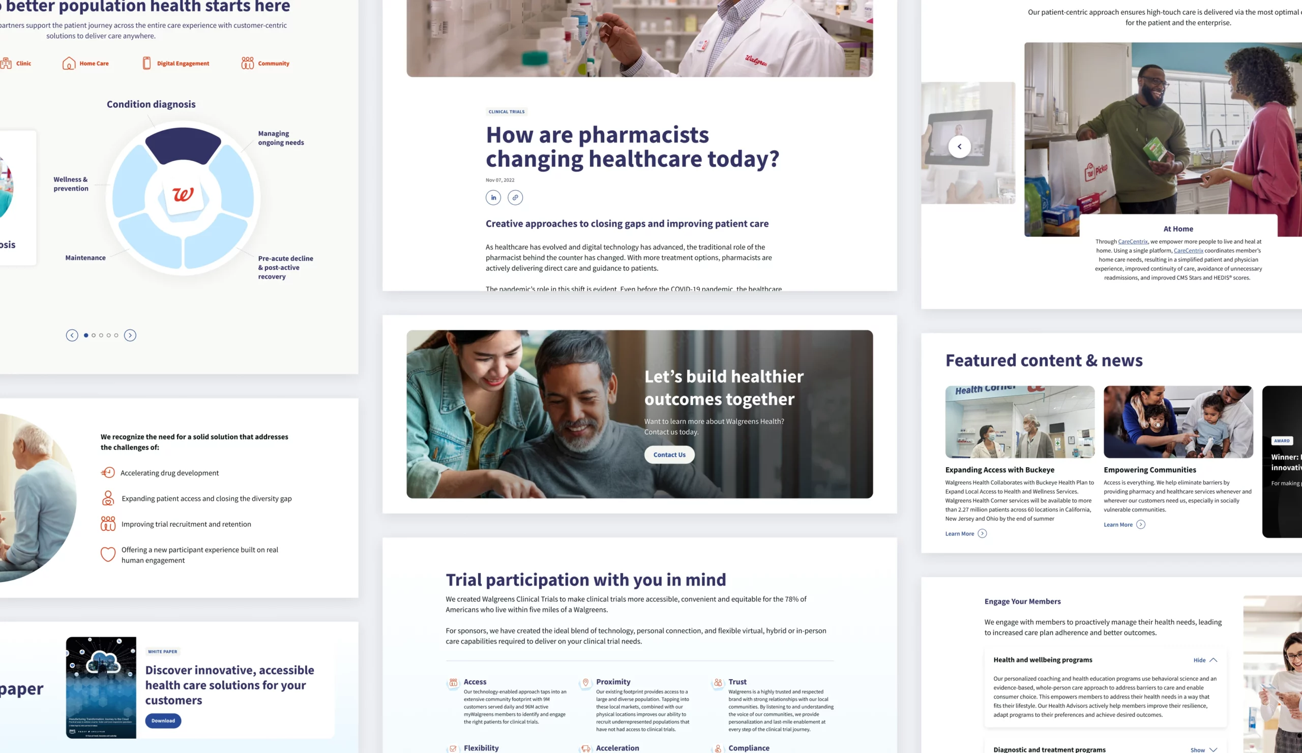
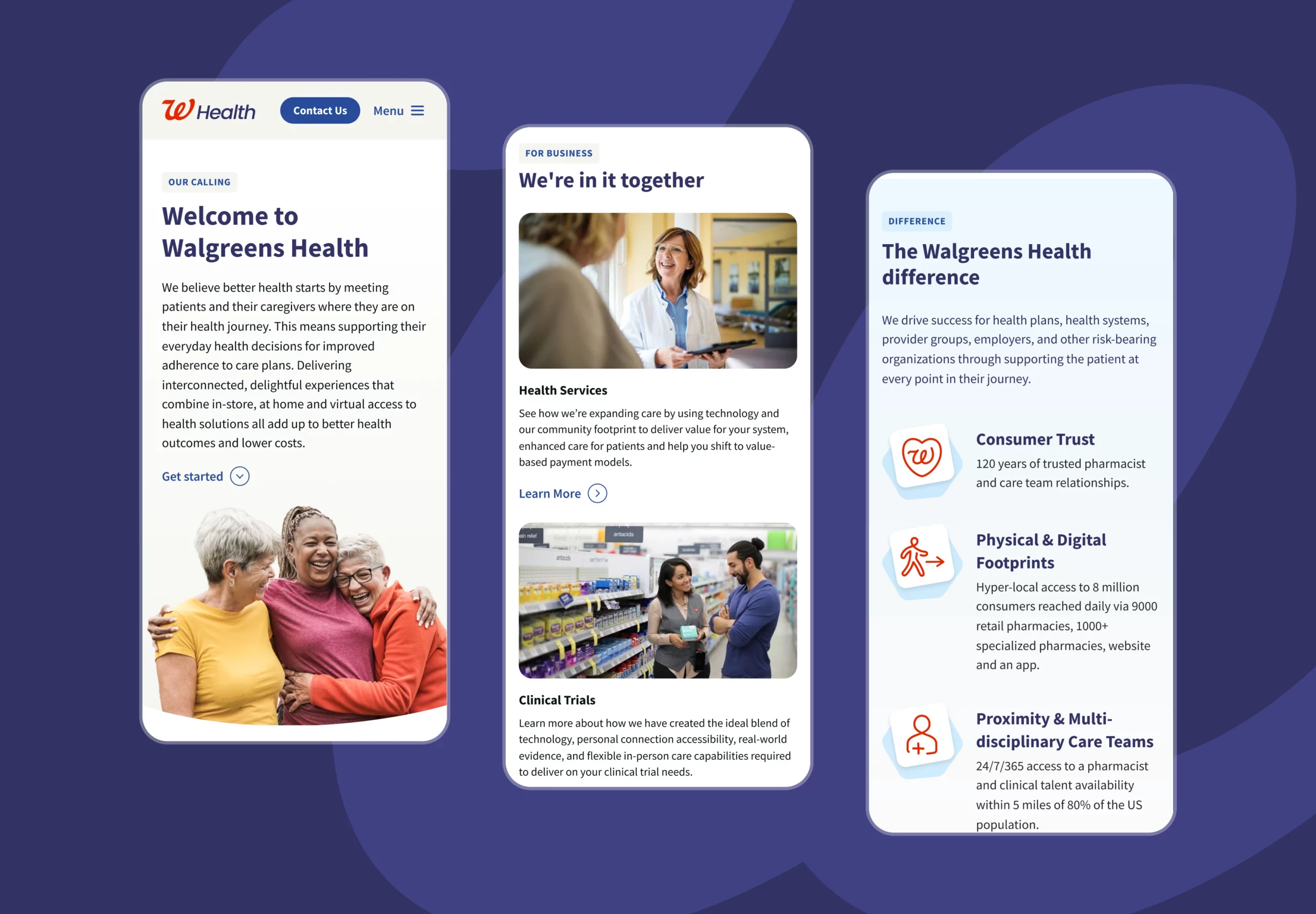
We delivered a fresh website — built on a flexible design system within Adobe Experience Manager — that positions Walgreens Health as a destination for patients, providers, and health-related content.
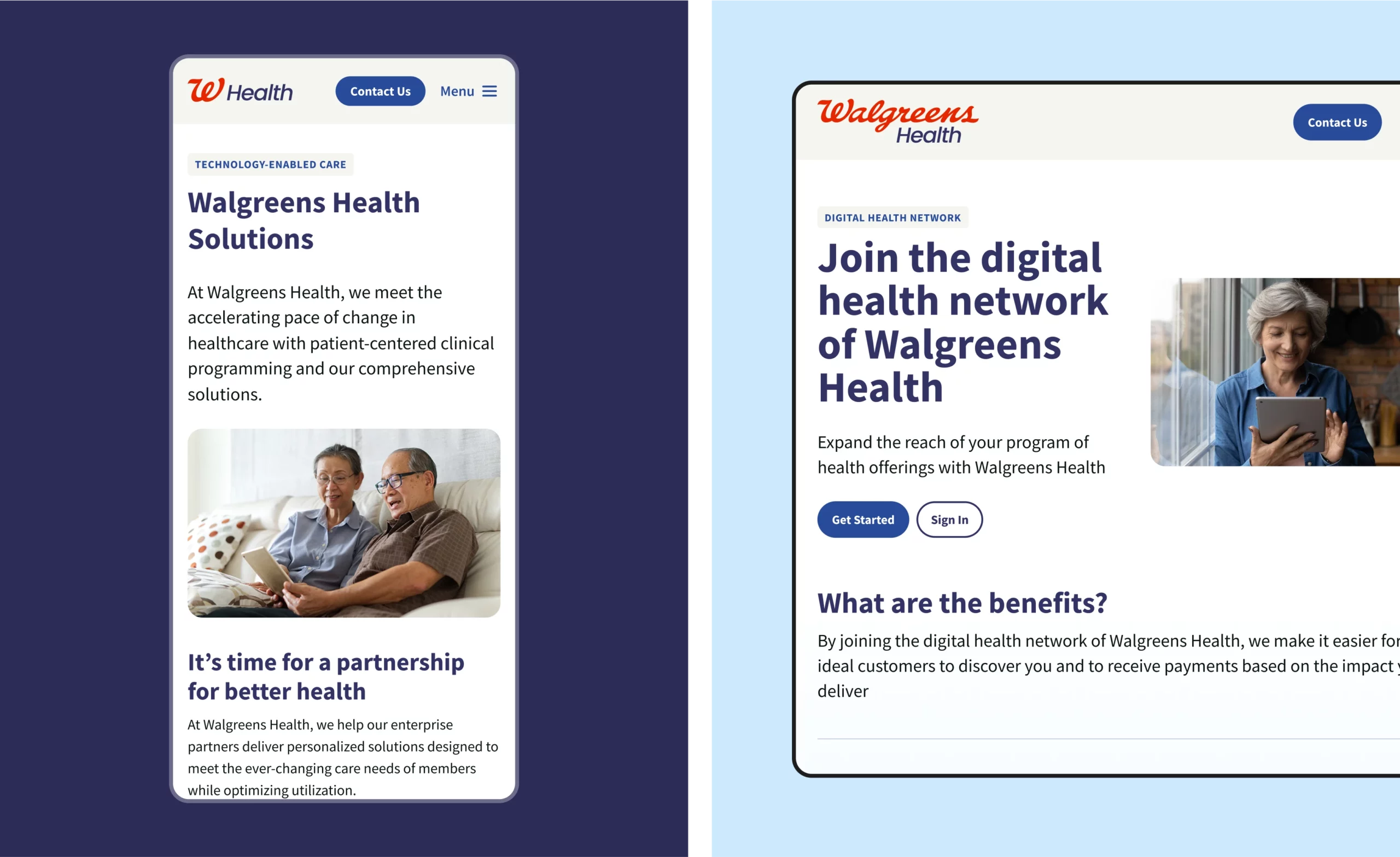
Because we onboarded mid-project, we had less than 48 hours to meet the first sprint goal: a responsive homepage that would set the tone for the rest of the site.
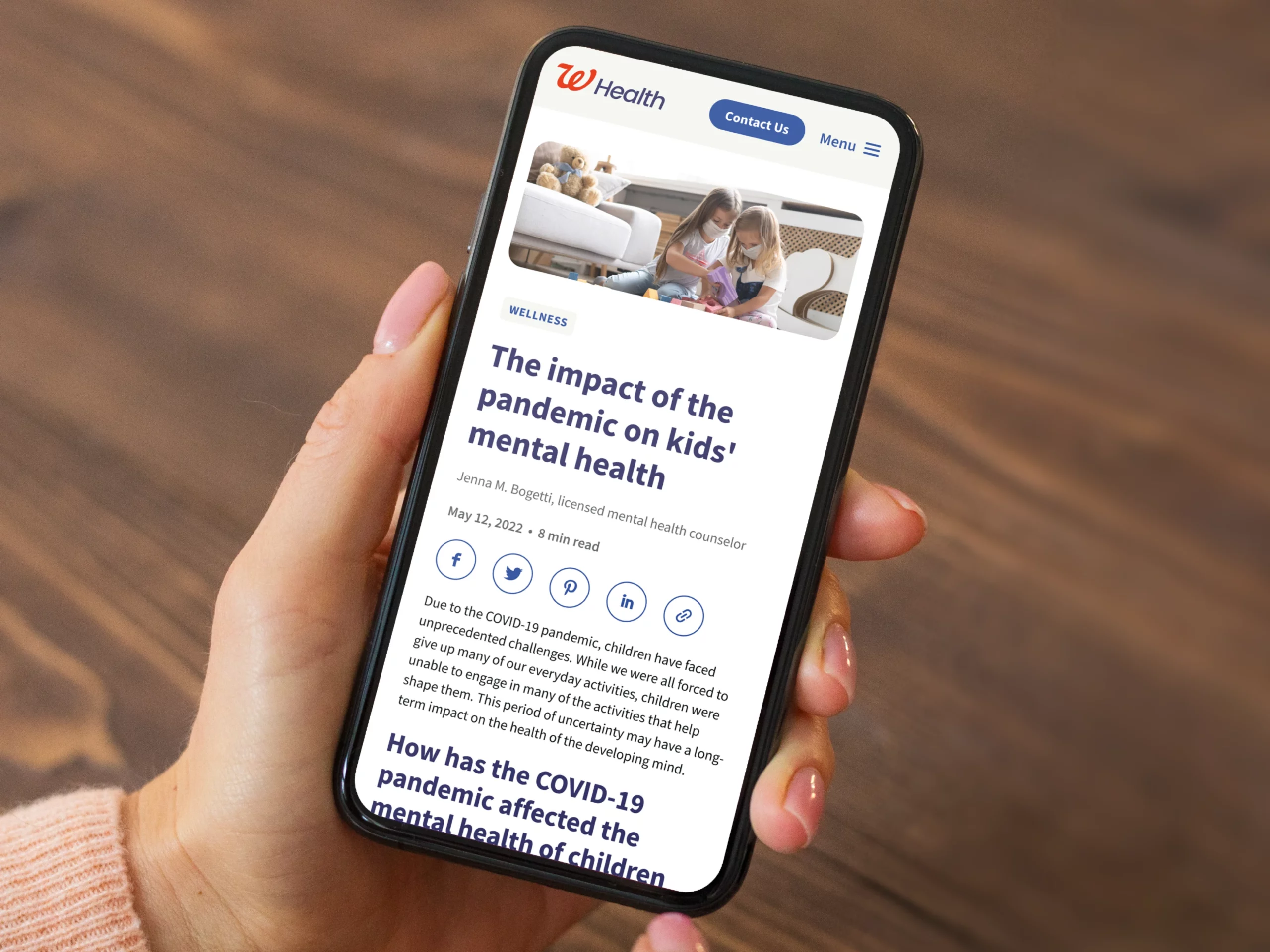
We then moved on to the rest of the site. With just three weeks and a handful of components to work with, we delivered a Most Lovable Product (MLP), targeted to providers, that we could build on over time. Once the MLP launched, we turned attention from the provider to the patient experience.
Creating a roadmap
We quickly identified areas for improvement, specifically around user flows and information architecture. We then identified short-term, 1-year, and future state navigations, creating a roadmap for content growth.
Elevating the design system
We pushed the design of components and page layouts to create an ideal version of the site (without straying from the brand, of course). This improved design system has since been used to to create new sections and related experiences of the site.
At the center of this project are people: the partners we collaborated with and the patients and providers Walgreens Health serves. The end result was more than just a website. We helped connects the dots between Walgreens Health, its people, and its processes.
